Date histogram aggregation in Elasticsearch
Introduction
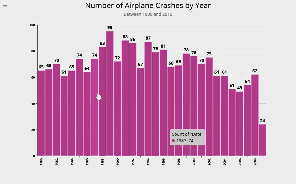
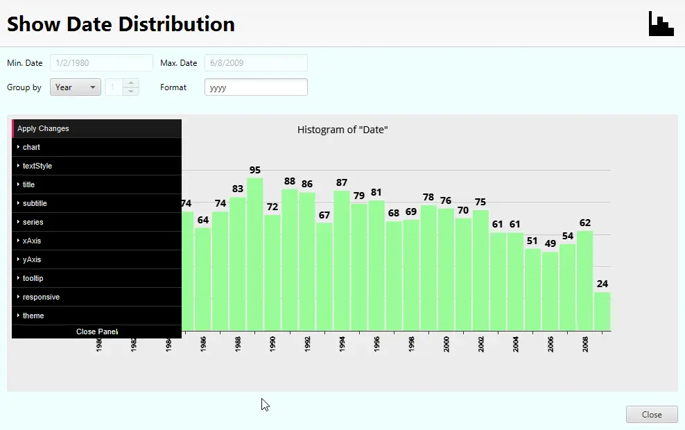
Elasticsearch supports the histogram aggregation on date fields too, in addition to numeric fields. A date histogram shows the frequence of occurence of a specific date value within a dataset. For example, the following shows the distribution of all airplane crashes grouped by the year between 1980 and 2010. From the figure, you can see that 1989 was a particularly bad year with 95 crashes. Information such as this can be gleaned by choosing to represent time-series data as a histogram.
Let us now see how to generate the raw data for such a graph using Elasticsearch. The graph itself was generated using Argon.
Generating Date Histogram in Elasticsearch
The request to generate a date histogram on a column in Elasticsearch looks somthing like this. The field on which we want to generate the histogram is specified with the property field (set to Date in our example). The interval property is set to year to indicate we want to group data by the year, and the format property specifies the output date format.
{
  "aggs": {
    "Date": {
      "date_histogram": {
        "field": "Date",
        "interval": "year",
        "format": "yyyy"
      }
    }
  },
  "size": 0
}
The response from Elasticsearch looks something like this. Note that the date histogram is a bucket aggregation and the results are returned in buckets.
...
    "aggregations": {
      "Date": {
        "buckets": [
          {
            "key_as_string": "1980",
            "key": 315532800000,
            "doc_count": 65
          },
          {
            "key_as_string": "1981",
            "key": 347155200000,
            "doc_count": 66
          },
          {
            "key_as_string": "1982",
            "key": 378691200000,
            "doc_count": 70
          },
          {
            "key_as_string": "1983",
            "key": 410227200000,
            "doc_count": 61
          },
...
Using stats aggregations to determine limits
To be able to select a suitable interval for the date aggregation, first you need to determine the upper and lower limits of the date. This can be done handily with a stats (or extended_stats) aggregation. The request is very simple and looks like the following (for a date field Date). Of course, if you need to determine the upper and lower limits of query results, you can include the query too.
{
  "aggs": {
    "stats": {
      "extended_stats": {
        "field": "Date"
      }
    }
  },
  "size": 0
}
The response from Elasticsearch includes, among other things, the min and max values as follows. The values are reported as milliseconds-since-epoch (milliseconds since UTC Jan 1 1970 00:00:00). Using some simple date math (on the client side) you can determine a suitable interval for the date histogram.
...
  "aggregations": {
    "stats": {
      ...
      "min": 315619200000.0,
      "max": 1244419200000.0,
      ...
    }
  }
...
Date Histogram aggregation with Argon
Argon provides an easy-to-use interface combining all of these actions to deliver a histogram chart. These include
-
Perform a query to isolate the data of interest.
-
Determine the upper and lower limits of the required date field.
-
Determine an interval for the histogram depending on the date limits.
-
Invoke date histogram aggregation on the field.
-
Collect output data and display in a suitable histogram chart.
Querying the data
You can build a query identifying the data of interest. We have covered queries in more detail here: exact text search, fuzzy matching, range queries here and here. We will not cover them here again.
Date Histogram using Argon
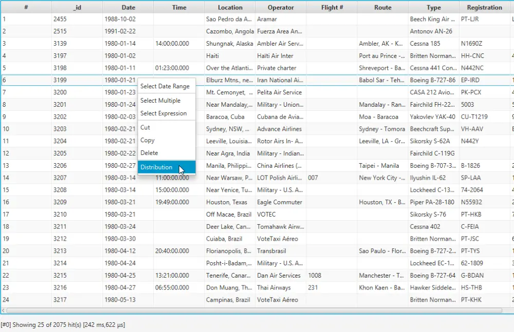
After you have isolated the data of interest, you can right-click on a data column and click Distribution to show the histogram dialog.
1. Right-click on a date column and select Distribution.
2. The Distribution dialog is shown.
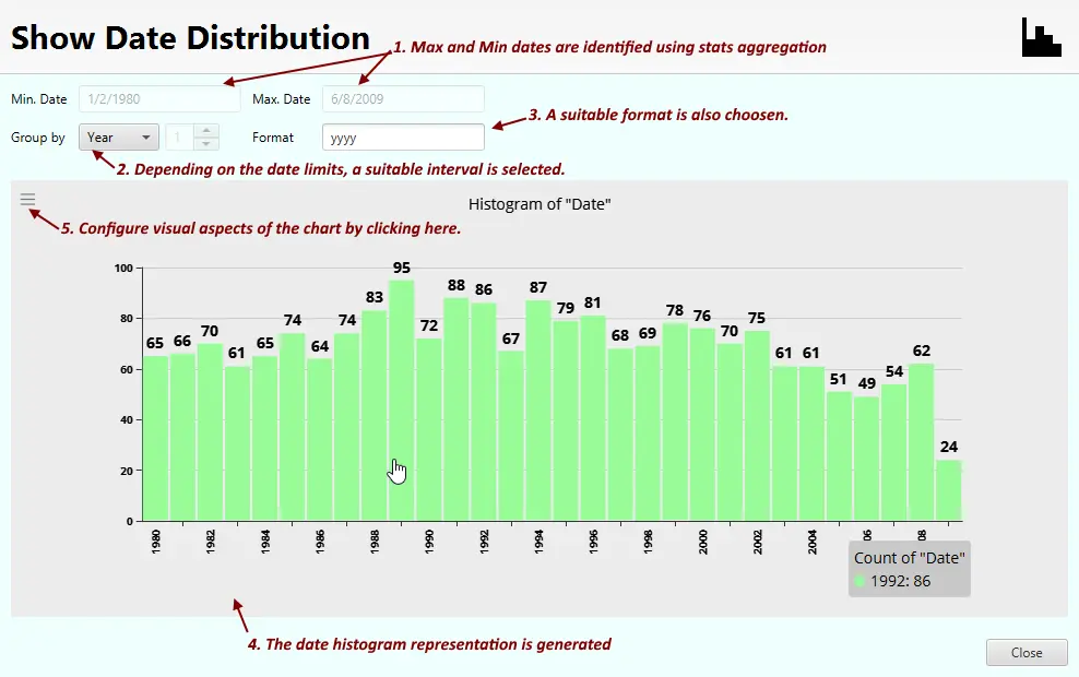
3. Configure the chart to your liking.
The histogram chart shown supports extensive configuration which can be accessed by clicking the bars at the top left of the chart area.
Some Examples
Following are some examples prepared from publicly available datasets.
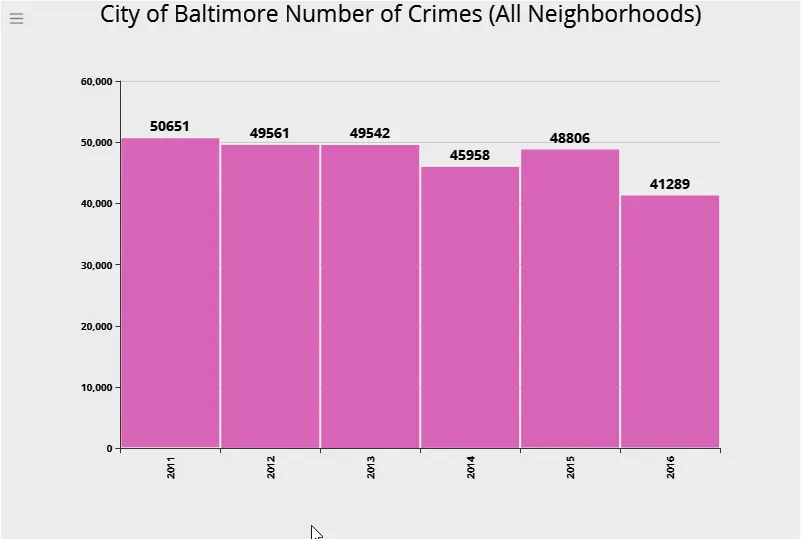
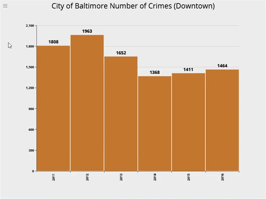
City of Baltimore Crime Data
1. Distribution of Crimes (Downtown).
2. Crimes in all neighborhoods.