Histogram aggregation in Elasticsearch
Introduction
A histogram is a representation of numerical data grouped into contiguous groups based on the frequency of occurence. It is used to indicate the distribution of data. For example, height of subjects in a population is a continuous variable (meaning it can take all values within its range), and it can be grouped into ranges such as: less than 5 feet, 5 feet to 5 feet 30 inches, and so on. The number of instances in each group is a histogram of its distribution.
The histogram aggregation
Let us look at how to generate a histogram using Elasticsearch. An example histogram request looks like this:
{
  "aggs": {
    "histogram": {
        "histogram": {
        "field": "Value",
        "interval": 200
        }
    }
  }
}
Using the stats aggregation to determine the interval
As shown above, the histogram aggregation requires an interval parameter which determines how many classes the histogram represents.
To determine a suitable interval, we need to know the minimum and maximum values on the field. These can be determined using the stats aggregation as follows:
{
  "aggs": {
    "stats": {
      "stats": {
        "field": "Value"
      }
    }
  },
  "size": 0
}
The stats aggregation is returned for the field Value as follows:
"aggregations": {
  "stats": {
    "count": 209,
    "min": 1879.0,
    "max": 3768.0,
    "avg": 2862.8803827751194,
    "sum": 598342.0
  }
}
Assuming we want about 10 buckets in the histogram, we choose 200 for the interval parameter.
A histogram example
Le us now look at an example. For our example, we have FAO data presenting the calories consumed by each person per day in each countries. The following query extracts the raw data for the year 2013.
{
  "query": {
    "bool": {
      "must": [
        {
          "term": {
            "Year": "2013"
          }
        },
        {
          "term": {
            "Element.keyword": "Food supply (kcal/capita/day)"
          }
        },
        {
          "term": {
            "Item.keyword": "Grand Total"
          }
        }
      ]
    }
  }
}
Which returns data as follows:
"hits": [
  {
    "_index": "foodsupply_crops_e_all_data_(normalized).csv",
    "_type": "doc",
    "_id": "491193",
    "_score": 7.691229,
    "_source": {
      "Area Code": 27,
      "Area": "Bulgaria",
      "Item Code": 2901,
      "Item": "Grand Total",
      "Element Code": 664,
      "Element": "Food supply (kcal/capita/day)",
      "Year Code": 2013,
      "Year": 2013,
      "Unit": "kcal/capita/day",
      "Value": 2829.0,
      "Flag": "Fc"
    }
  },
  {
    "_index": "foodsupply_crops_e_all_data_(normalized).csv",
    "_type": "doc",
    "_id": "514831",
    "_score": 7.691229,
    "_source": {
      "Area Code": 233,
      "Area": "Burkina Faso",
      "Item Code": 2901,
      "Item": "Grand Total",
      "Element Code": 664,
      "Element": "Food supply (kcal/capita/day)",
      "Year Code": 2013,
      "Year": 2013,
      "Unit": "kcal/capita/day",
      "Value": 2720.0,
      "Flag": "Fc"
  }
...
Combining this query with the histogram aggregation as shown above, we have the following request:
{
"query": {
"bool": {
"must": [
{
"term": {
"Year": "2013"
}
},
{
"term": {
"Element.keyword": "Food supply (kcal/capita/day)"
}
},
{
"term": {
"Item.keyword": "Grand Total"
}
}
]
}
},
"aggs": {
"histo": {
"histogram": {
"field": "Value",
"interval": 200
}
}
},
"size": 0
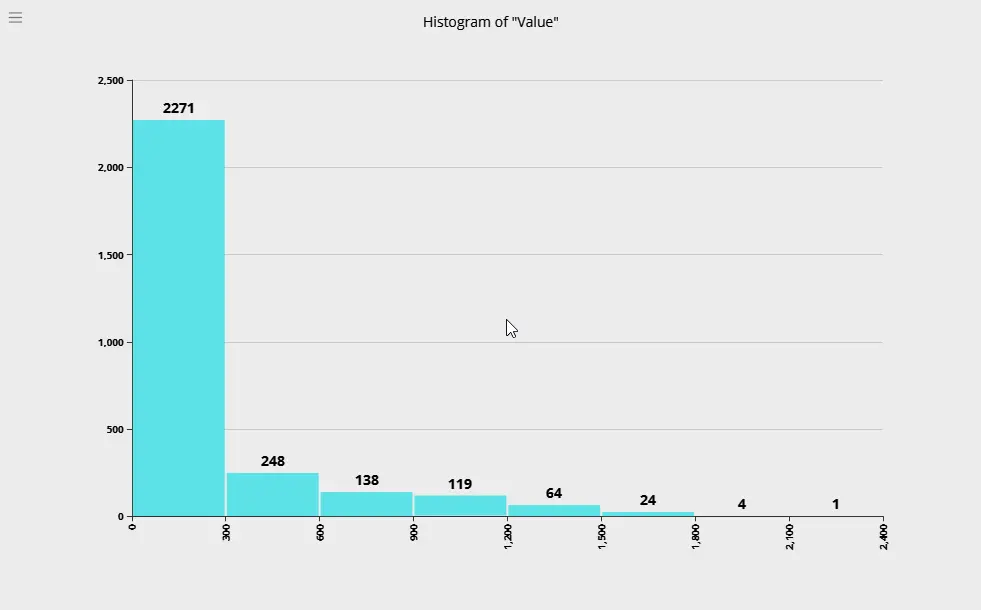
}We have turned off the hits comprising the aggregation by setting size to 0. Executing this aggregation results in the following response:
"aggregations": {
  "histo": {
    "buckets": [
      {
        "key": 1800.0,
        "doc_count": 2
      },
      {
        "key": 2000.0,
        "doc_count": 11
      },
      {
        "key": 2200.0,
        "doc_count": 18
      },
      {
        "key": 2400.0,
        "doc_count": 29
      },
      {
        "key": 2600.0,
        "doc_count": 37
      },
      {
        "key": 2800.0,
        "doc_count": 30
      },
      {
        "key": 3000.0,
        "doc_count": 28
      },
      {
        "key": 3200.0,
        "doc_count": 29
      },
      {
        "key": 3400.0,
        "doc_count": 18
      },
      {
        "key": 3600.0,
        "doc_count": 7
      }
    ]
  }
}
Displaying a histogram in Argon
Argon provides an easy way to view the histogram distribution of a field.
1. After loading the data in the Explorer View, right click on the column to pull up the context menu.
Choose Distribution from the context menu.
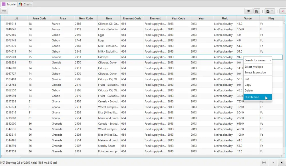
2. The Distribution box shows the histogram.
-
Minimum and maximum values applicable are shown.
-
You can change the number of classes to divide the range into.
-
The interval changes appropriately when the number of classes are changed.
-
The histogram is updated automatically. For each range, it shows the number of records than fall within that range.

3. Resize the Distribution box window to update the display.
Some Example Histograms
In the following sections we present some example histograms using data from the Worldbank Development Indicators.
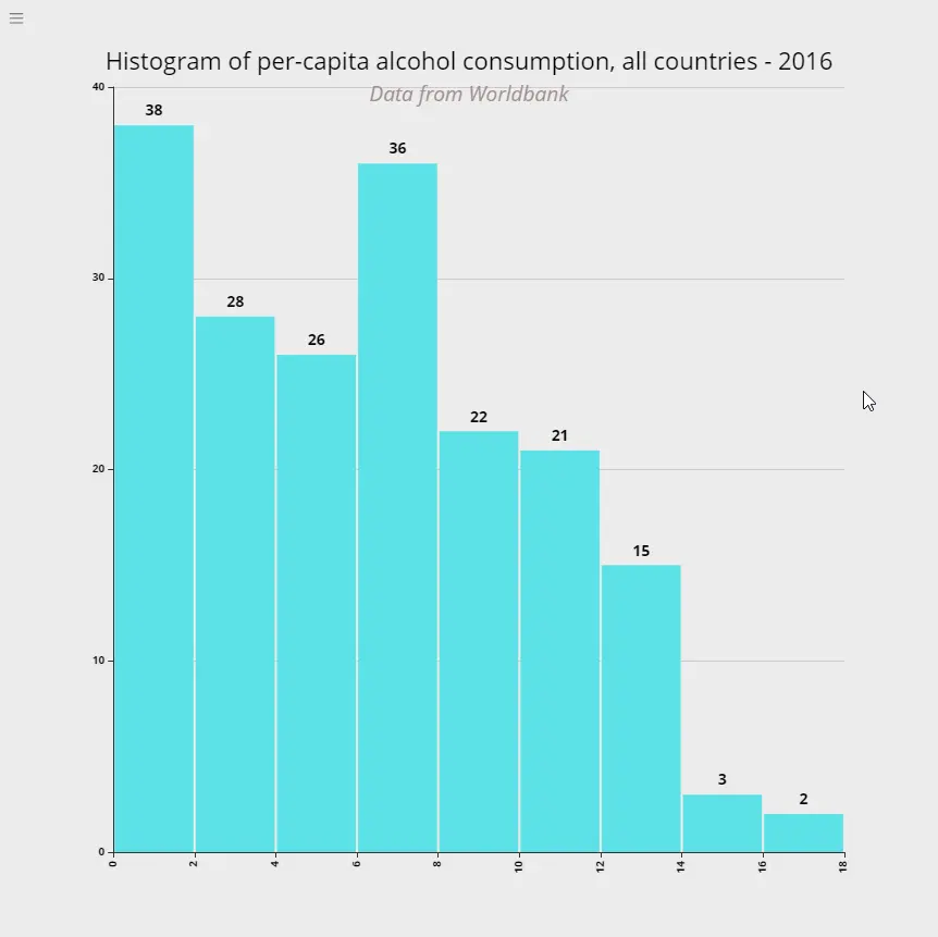
Alcohol Consumption across countries
The following is the distribution of per-capita alcohol consumption across countries for the year 2016.
What it means: 38 countries had an alcohol consumption rate of upto 2 litres per year. 36 countries consumed between 6 and 8 litres of pure alcohol per year. The highest was 2 countries consumed between 16 and 18 litres of alcohol per person per year. All numbers for 2016.
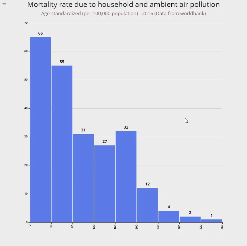
Mortality rate due to air pollution
This chart represents the death rate (per 100,000 population) due to household and ambient air pollution in 2016.
What it means: Upto 40 people per 100,000 population died in 65 countries due to household and ambient air pollution. In 3 countries the death was between 280 and 360 per 100,000 population.
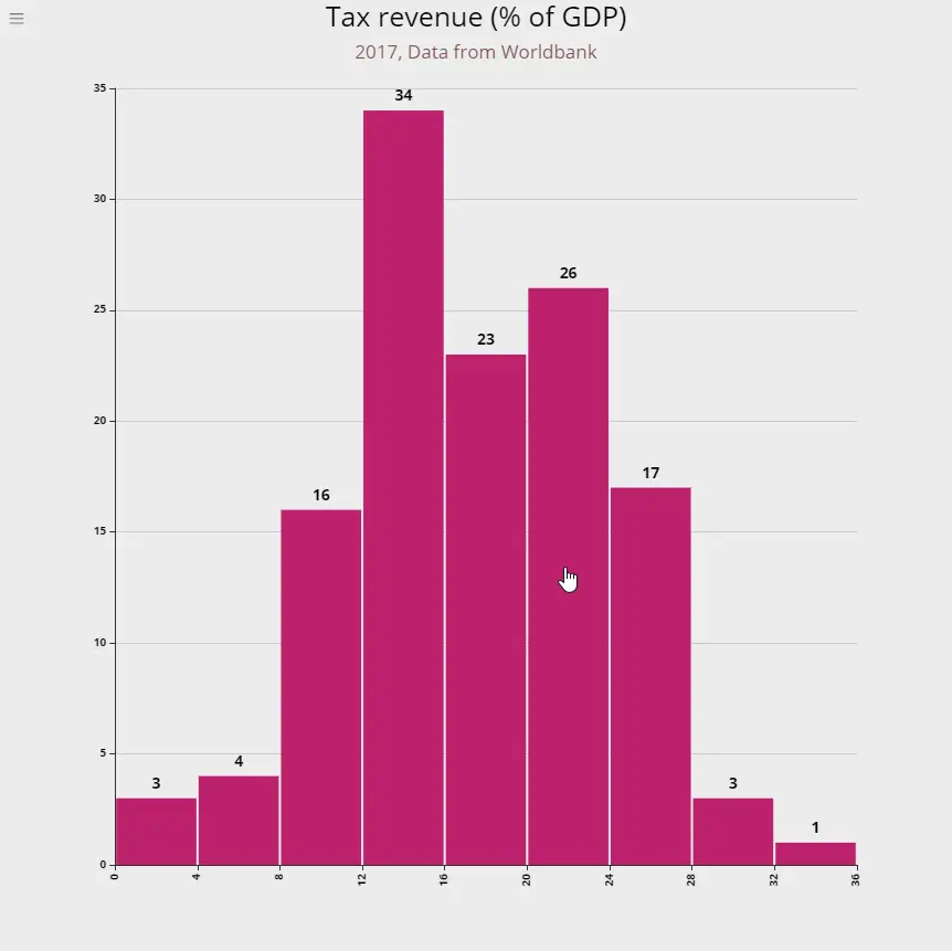
Tax revenue as percent of GDP
Tax revenue refers to compulsory transfers to the central government for public purposes. Certain compulsory transfers such as fines, penalties, and most social security contributions are excluded. Refunds and corrections of erroneously collected tax revenue are treated as negative revenue.
What it means: 34 countries have a tax revenue between 12 and 15% of GDP. 3 countries have the lowest rates of 0-4% of GDP and 4 countries can be considered heavily taxed at between 28-32% of GDP.
Suicide mortality rate
Presented below are the number of suicide deaths in a year per 100,000 population.
What it means: 32 countries have a suicide death rate of 0-4 persons per 100,000 population, while 62 countries have a rate of 4-8 persons per 100,000 population. 3 countries have the highest rates of 28-32 persons.

DPT immunication rates of children
Next up is the rate of Immunization of children against DPT. The measure is the percent of children ages 12-23 months.
What it means: Thankfully there are no countries which do not immunize against DPT due to whatever misguided notion.The highest rates are 67 and 66 countries which cover between 88% to 100% of the children.

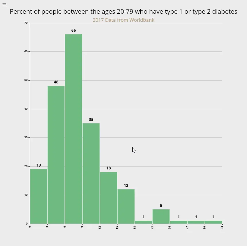
Diabetes prevalence rates
Raes of diabetes prevalence among people ages 20-79 who have type 1 or type 2 diabetes.
What it means: 19 countries have the lowest diabetes prevalence rates between 0-3% while 3 countries have the highest prevalence rates between 24-33%. The largest number of countries (66) have a rate of between 6-9%.
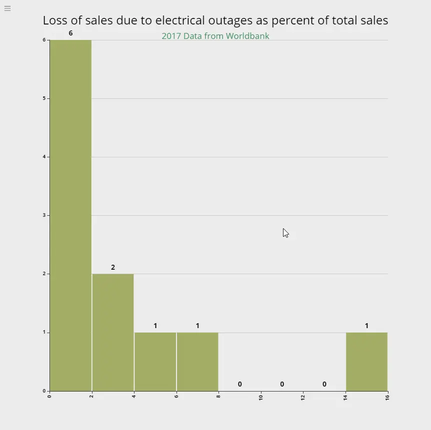
Losses due to power failure
This measure represents loss of sales due to electrical outages as a percentage of total annual sales, and represent average losses for all firms which reported outages.
What it means: 6 countries reported loss of sales between 0-2% in 2017, while 1 country reported a loss of 14-16% of the total sales.
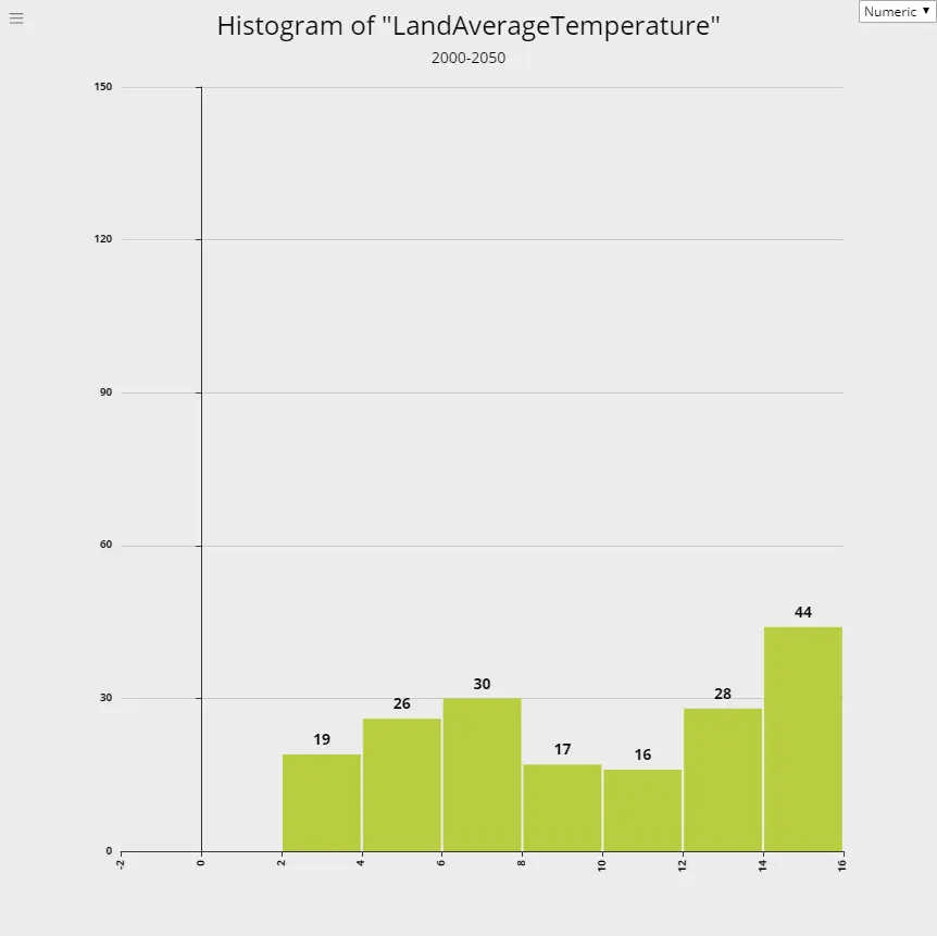
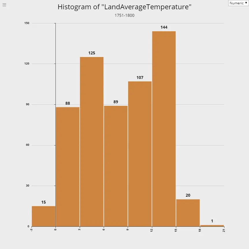
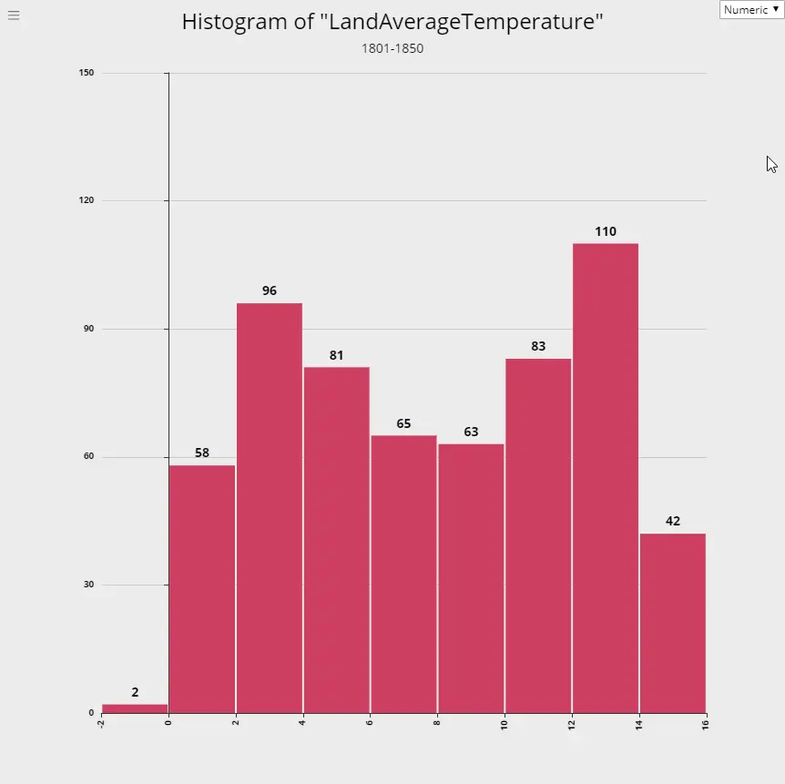
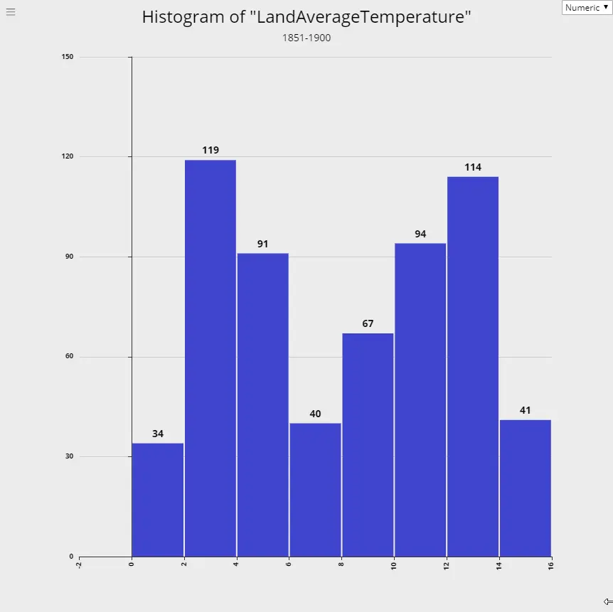
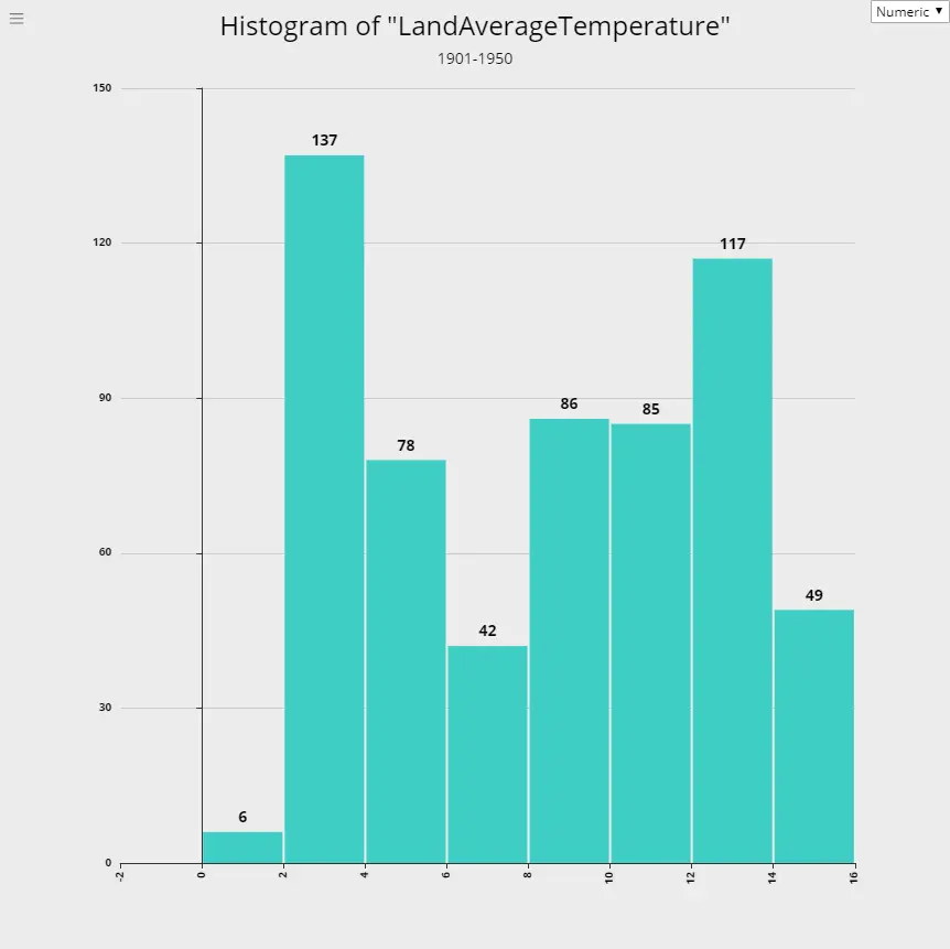
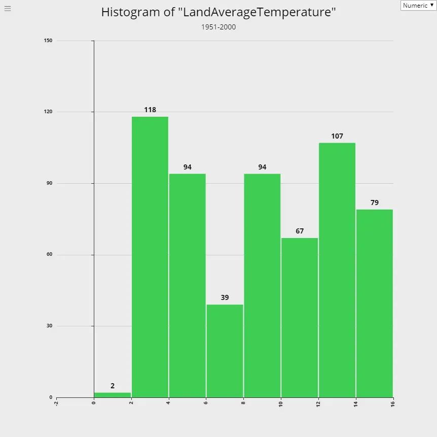
Global Warming - Rising Temperature Trends
Using data from global land temperatures tracked from 1750 through 2015, we prepared the following histograms for each 50 years period. If you observe these 50-year trends of the temperature, you can see that histogram moves slowly towards higher temperatures with each period, indicating a rise in global warming.
1. 1751-1800
2. 1801-1850
3. 1851-1900
4. 1901-1950
5. 1951-2000
6. 2001-2015